
Life of PiOur third class started with a review of the lab results from “Finding Pi.” One team calculated a value for pi that was within 0.2% of the actual value and another team was within 0.5%. A typical error would have been 3.0%, so they did some really awesome measurement! As we compared everyone’s findings we noted differences in the data even when the same object was being studied. This led us into a good discussion of “sources of error” that creep into any project: variations in the object (e.g. hula hoops are rarely round!), precision of measuring tools (we used fabric tape rulers and meter sticks), and accuracy of our observations (not measuring several points, not using the full 0.05 cm resolution of the rulers). We wrapped this lab up with a basic outline for an engineering report:
On Target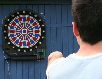 The class then tackled another vital engineering tool. Engineers use statistical analysis to tell if a process is performing the way it should. Each student was given a list of 30 values to plot on an x-t chart and then we studied them to see what the charts were telling us about performance. Some plots were tight and centered about the target line, some were tight but consistently off target, and others bounced around widely. We were able to discuss the difference between “precision” and “accuracy,” critical for making decisions. We used an example of five arrows shot into a target. Precision means that all of the arrows hit in the same area. Accuracy means that the arrows were evenly spread around the center of the target. The goal is to be both precise and accurate – put all of the arrows together in the middle of the target – and each is accomplished using different techniques. Homework for Next SessionBefore we meet again, I would like the students to re-draw their control charts neatly. They should be drawn in landscape mode in their journals and should be labelled so that the data points are spread vertically on the page (i.e., not in a single tight space down the center of the chart!). The “Target” line should be at a value of 100 and the y-axis should have a scale of four squares for every 10 points. For example, four squares above the 100 line would be the 110 line, four squares up from there would be 120, etc. Draw dashed lines across the chart, one at 80 labeled “LSL” (lower spec limit) and one at 120 labeled “USL” (upper spec limit”). Then plot each value across the chart and connect the data points with straight lines. The final step is to look at the data points and highlight (or circle) any points where:
I’m looking forward to our next session! Comments are closed.
|
Categories
All
Archives
May 2016
|
 RSS Feed